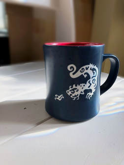
Benched
|
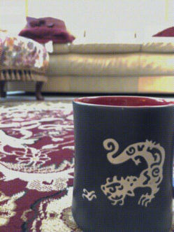
Living
|
I chose this setting because it uses the refraction of natural light through my front door. You can see rainbow colors if you look closely enough. This effect was to give the environment of the mug some sort of depth and meaning instead of a plain white background. In photoshop, I blurred the background slightly to remove sharp edges and I deepened the contrast to bring out the rich reds. I also lowered the exposure to make sure the light was not too glaring. I used my living room as a background for the second photo because I wanted to tell a story about the mug in a realistic environment. Notice how the dragon on the mug resembles the pattern of the rug it's sitting on. I brightened the photo slightly to take attention away from the windows onto the mug. I also applied a color halftone filter to blend the rich colors together more. The red of the mug was much more vibrant than the colors of the rug and pillow, but this filter was able to bring them closer together.
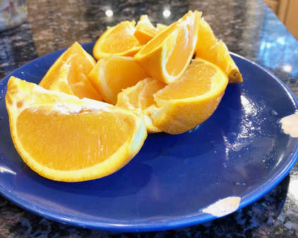
Small
|
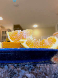
Gigantic
|
I decided to use two different perspectives for this plate of oranges. In the first, it is a top-down (more or less) view, and it makes the oranges seem less imposing than the second photo, where it looks like they are superior to the plate beneath them. In both, I adjusted brightness and contrast to bring out the orange colors. I also lowered exposure to reduce the harsh glares. In the second photo, I applied a crystalize filter to make the textures of the orange more delectable.
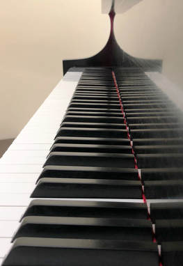
Infinite Keys
|
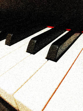
Black or White?
|
For the piano keys, I took a unique approach to both. In the first, I took the photo from one end of the keyboard to make it look as if the keys go on for eternity. It really brings out the grandeur of the instrument. In the second one, I got close and took a diagonal picture of the keys in a way that made the darks and the lights cover an equal amount of the photos. It's true that the white keys are actually larger, but through this perspective, I was able to even it out a little. I increased the contrast for both photos, but for the second one, I applied a mezzotint filter to texturize the keys and give them more dimension. It really emphasizes the 3D aspect of the photo.
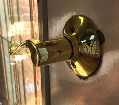
When Life Closes a Door...
|
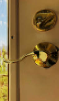
Undecryptable
|
For the door knob of my front door, I chose a close-up, cinematic angle to make the knob seem larger and more powerful than it might really be. This creates a confidence in the viewer that by opening the door, the possibilities are endless. For the second, I included the lock above the handle in a straight-on view to show the balance of the two mechanics and how they must work together to function properly. I increased the brightness and contrast slightly to bring out the gold in each photo, but applied a mosaic filter to pixelize the handle. This creates an effect that make the door handle seem more difficult to get past.
Melancholy Melody
|
Distorted Self-Image
|
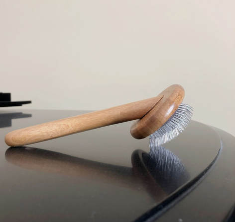
I used my dog's hairbrush in different settings to try to connect the objects in our daily lives. In the first, the brush is laid on the piano in a way that
